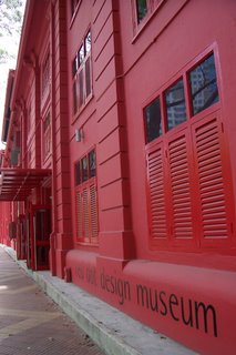
June Yong's post on Yesterday.sg titled Baby, You can turn me on prompted me to visit the Red Dot Museum when I was at Tanjong Pagar area for lunch recently.
The Red Dot Museum is housed within the building named Red Dot Traffic.
What caught my eye most of all when I was approaching the Red Dot Museum was the striking red colour of the Red Dot Traffic building. I got to find out that this colonial-style building used to be the headquarters of the traffic police.
Unconvinced that anyone would have painted the building's exterior completely red, I walked around the perimeters of the building. True enough, the back of the building was in white. My only question on my mind was: Is that white colour the original colour of the building? Could someone please enlighten me?
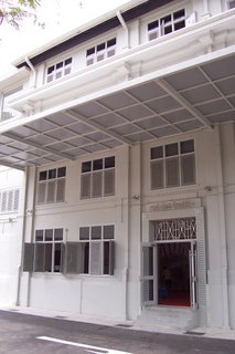
When I was at the entrance of the Red Dot Museum, I took a while to read the basic general information to find out if I had missed the operating hours, and to find out the admission rates. For your convenience, please refer to this URL for the visitor's general information:
http://www.red-dot.sg/concept/museum/general.htm
After much thought, I decided to visit the museum.
On hindsight, I wish there was a designer who could share with me the concepts behind the various designs. Reading the synopsis and the description helped a bit, but it did not bring the designs to life.
I know I might have enjoyed the visit much more if I could better understand the cultural and societal context in which the designer of each piece of work comes from. It would have been beneficial if the designer could be present to share with me his/her source of inspirations. All these might have helped me better appreciate why certain works were designed in particular ways. Otherwise, those exhibits are just simply exhibits to me. They can never transcend into objects with interesting stories to tell and practical functions to perform.
Nevertheless, I have gathered some exposure to some new ideas.
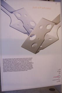
I thought it was a brilliant idea to have a tool that not only slices the cake, but could also be used to serve the sliced piece of cake.
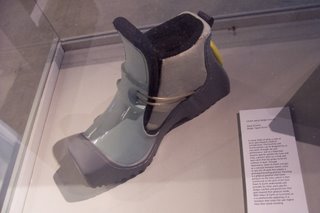
This shoe is special. I understand that it is designed for people who may have be in a prolonged kneeling position in the course of doing their work. A practical yet interesting design, in my opinion.
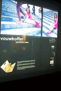
The portfolio case looked simple yet functionable. I like its light and simple design.
If you were to ask me if I would visit this museum again, my answers would go like this: If there is a change in exhibits, or if there is a guide who is a designer himself/herself to enlighten me on how to better appreciate the designs.
Otherwise, I anticipate that I could not quite relate very much to the exhibits as I would like to. Maybe I have higher expectations?
That aside, I was making a visit to the museum's ladies and I found that even the taps in the washrooms have quite interesting designs. Please view below for an example:
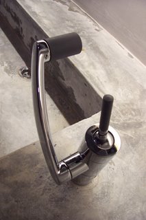
After the visit to the museum, I walked about the building. There is a relatively quiet Pacific Coffee cafe within the premises of Red Dot Traffic. I might have sat down for a breather if not for the fact that I was not in the mood to sit in a cafe then.
Enough said, do read June's post: Baby, You can turn me on. It has a more enthuasiastic tone than this very post.
No comments:
Post a Comment